BLAZON: verb - 1. To depict heraldic arms with their proper terminology and tincture rules. 2. To proclaim, publish, or make publicly known; to display conspicuously.
In medieval heraldry, a blazon was the formal, codified language used to describe a coat of arms so precisely that any herald across the continent could recreate it perfectly without ever seeing a drawing. It governed how symbols, shapes, and colors interacted to declare ownership, allegiance, and authority on a chaotic battlefield.
As kingdoms evolved into nation-states, these complex shields were simplified into national flags designed to unite diverse territories under a single, instantly recognizable symbol both on the battlefield and the global stage.
Wordmarks, logos, and color hex codes of are the heraldry of the modern-day market: declaring allegiance, history, and identity across every company's product SKU... transforming abstract corporate values into unyielding visual assets that must command attention on the crowded retail shelf.
My mission was to play the role of the Grand Herald for a fractured empire. Stakeholders demanded a massive shift in our packaging hierarchy: the Sovereign Motto (wordmark) and Supreme Crest (logo) were to be elevated above individual Faction Titles (product names) to assert absolute brand dominance across the shelves. Concurrently, I had to integrate a visually aggressive American flag background across our entire multi-SKU lineup without erasing the fiercely guarded House Colors of our established lines, all while elegantly hoisting our Seal of Origin ("Made in USA" badge).
My first duty was to map out the conflicting visual constraints of this new landscape, ensuring our corporate authority reigned supreme without causing a catastrophic civil war among our product lines.
The field surveyed. Now to raise the banner.
"Gongs and drums, banners and flags, are means whereby the ears and eyes of the host may be focused on one particular point."
- Sun TzuOut of Many, One
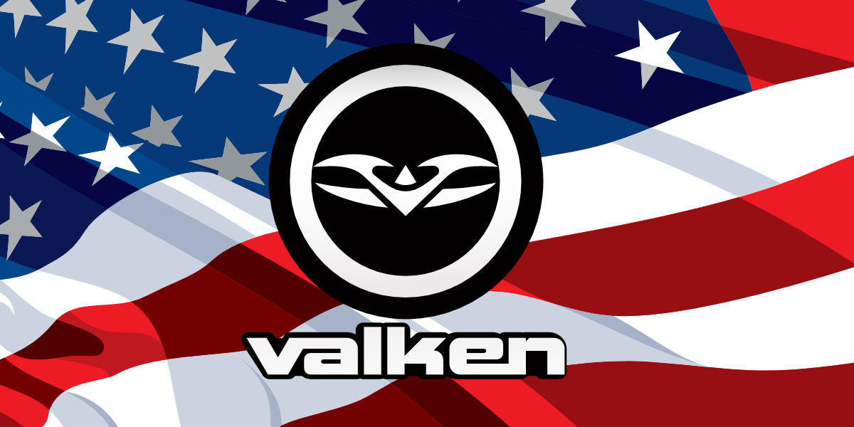 The Merica branded graphic with wordmark and old logo.
The Merica branded graphic with wordmark and the old encircled-logo.
In heraldry, the "charge" is the primary symbol or emblem placed upon a shield to dictate its core meaning and purpose. Valken had recently opened a new new paintball manufacturing subsidiary, Victory Gelcaps, in California and they wanted to focus on "USA Made Paintballs" as a central marketing push.
Executive leadership designated the waving American flag graphic that was the central element of our "Merica" paintball line as our universal charge... the central background motif for every single box across our entire paintball portfolio.
However, the asset provided was a hyper-saturated flag in full motion, complete with heavy shadows, deep fabric folds, and overwhelming patriotic hues.
My task was to take this visually aggressive, chaotic background asset and somehow transform it into a cooperative design layer that wouldn't overpower text, or clash with product line colors, while retaining readability and brand recognition on the retail shelf.
To tame this visual noise without violating our brand mandates, I stripped the asset down to its absolute structural essence, discarding gradients, shadows, and the superimposed field of grey dots that were on the original Merica box designs.
In their place, I engineered a highly simplified, flat vector graphic composed entirely of rich blacks and cool grays. This captured the flag's physical motion purely through crisp, undulating vector linework and allowed the flowing geometry to convey movement rather than relying on lighting effects.
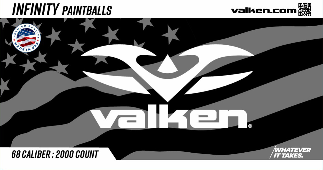 The Merica branded graphic in grey for the new Valken Infinity paintball box.
The Merica branded graphic as a grey background element for our Infinity line of Paintballs, which had a white brand color designation.
By flattening the flag into a sleek, damask vector texture, I successfully neutralized its visual aggression while fully preserving its "American Made" symbolism... transforming it into an elegant, unifying frame that seamlessly bound our entire packaging lineup together under one marketing motif.
The motif marked. Now to raise the banner higher.
Conquering the Field
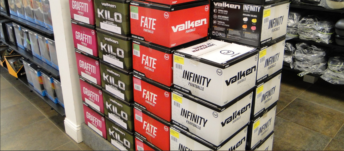 Older Valken paintball boxes displayed in a retail setting.
Paintball boxes were predominantly sold at paintball fields stacked on floor displays.
Paintball B2B retail happens on the literal field, where inventory is stacked on wooden pallets and floor displays. Our legacy packaging lacked long-distance brand recognition in these environments, but executives still demanded a heavy "USA Made" push.
I solved this by weaponizing the historically ignored top flaps of our boxes, transforming these flaps into high-impact retail signage.
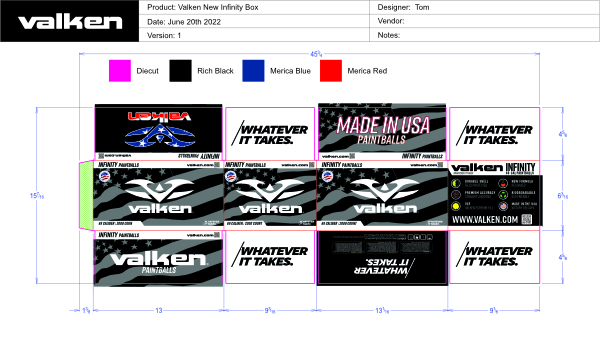
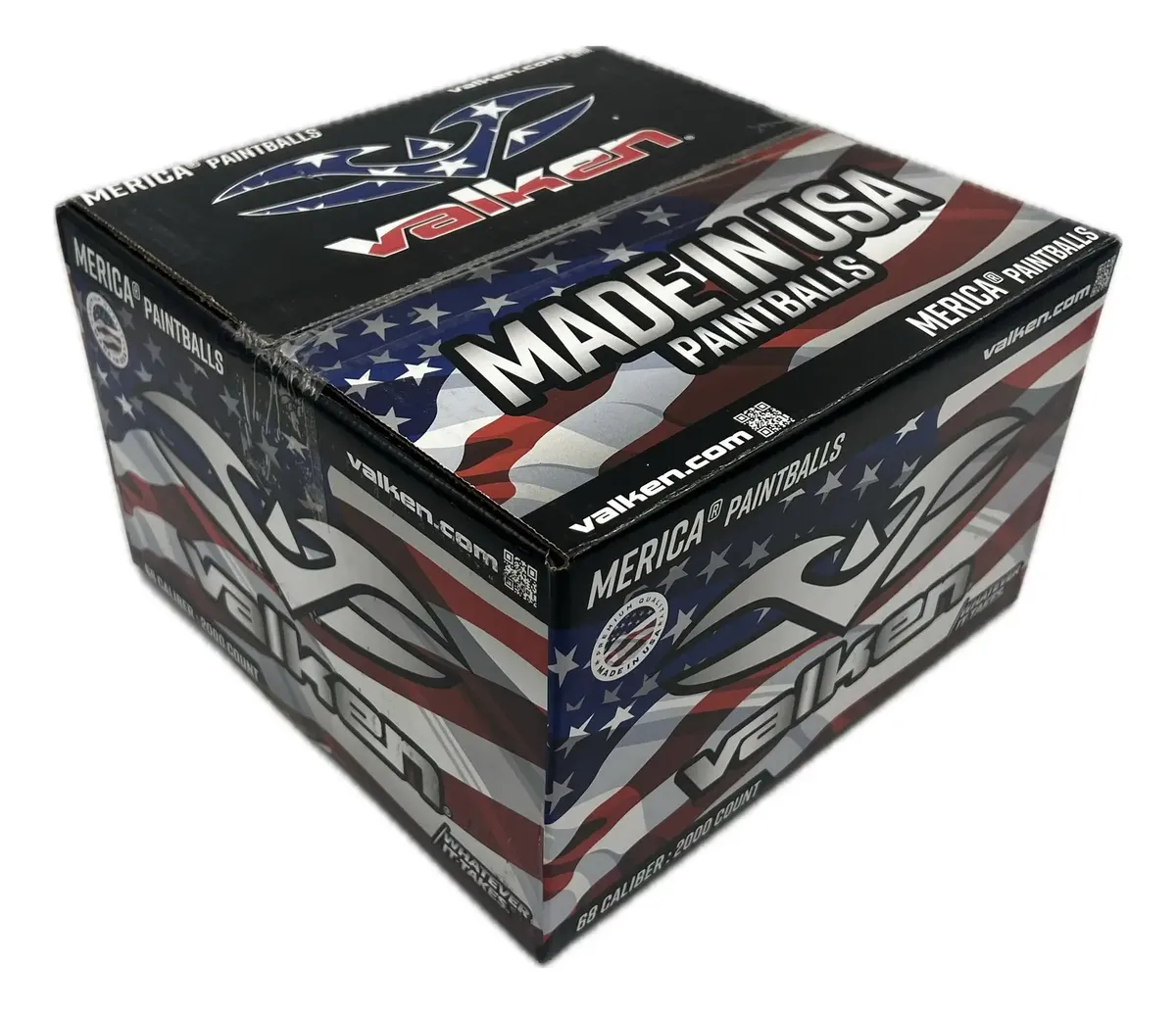 Valken Merica paintball box with integrated box-top retail POP graphics.
I placed a Merica branded logo and wordmark on the top of boxes with MADE IN USA so retailers could use the box as a retail display.
By featuring a full-color patriotic Valken wordmark + logo on one flap and a bold, heraldic "MADE IN USA" badge on the other, we enabled field owners to tip the top boxes on their sides, instantly converting raw pallet storage into a self-merchandising point-of-purchase display.
Shifting the full-color flag blast to the top flaps gave management the aggressive patriotic branding they wanted, preserved the vital color-coded SKU identity on the front panels, and handed our B2B field clients a free, effortless tool to drive retail sales right off the pallet.
The redesign was an overwhelming success across all internal and external channels. Stakeholders instantly approved the "Seal of Origin" top flaps... praising the strategic use of dead space to satisfy executive branding goals... while B2B field owners heavily utilizing the built-in pallet display feature.
Because this rollout coincided with a broader launch of our new retail merchandising assistance kits (detailed further in the Chapter named "Frequent Buyers"), our dealers saw the packaging as a tangible extension of our company motto, "Whatever It Takes", deepening our B2B brand loyalty.
The Seal of Origin proclaimed. Now to raise the banner higher.
"The meaning of a word, to me, is not as exact as the meaning of a color.
Colors and shapes make a more definite statement than words."
The Rule of Tincture
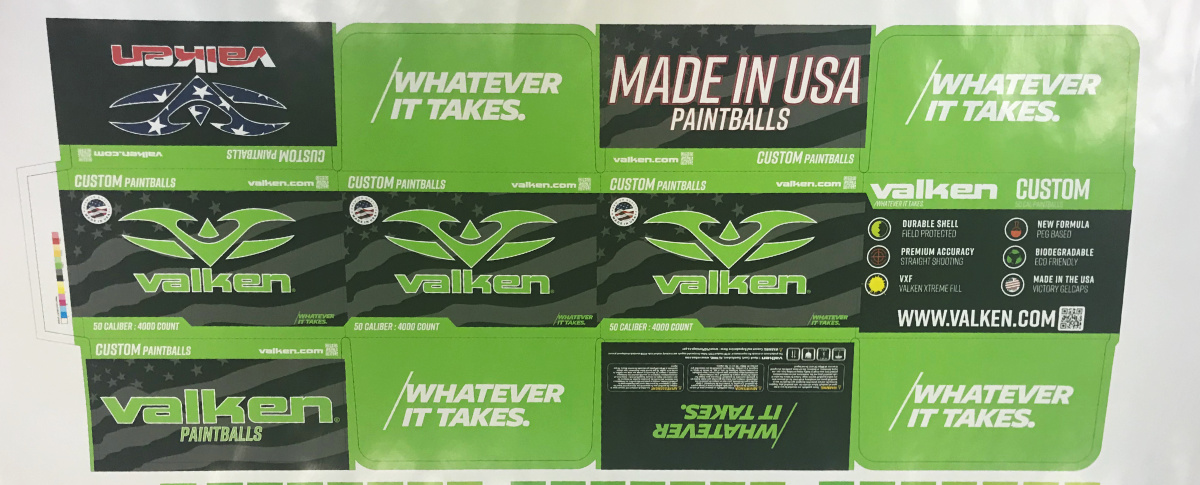 A proof of the new Valken Custom 50cal paintball box.
Each paintall line had their own dedicated brand color.
In historical heraldry, the Law of Tincture was the ultimate standard for legibility. Its primary decree was simple: never place a color upon a color, or a metal upon a metal. If a knight’s coat of arms violated this rule, their identity vanished into a muddy blur across a chaotic medieval battlefield.
Our retail environment presented a remarkably similar crisis. By stripping the traditional red, white, and blue from the American flag background and rendering it as a neutral, monochromatic asset of rich blacks and cool grays, I had effectively resolved our background conflict.
However, the true victory lay in how I chose to weaponize color on top of that canvas to rebuild our product family hierarchy... employing the Neuroscience of Color Supremacy.
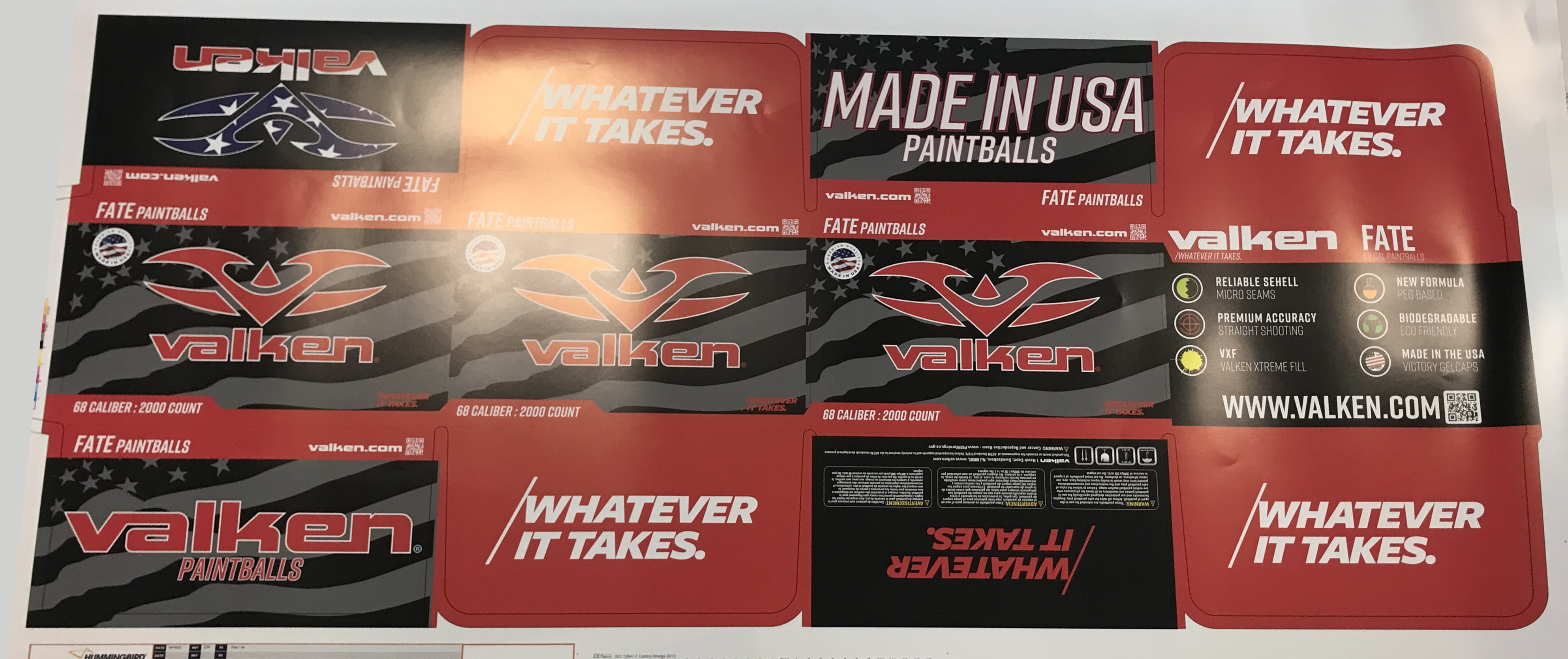
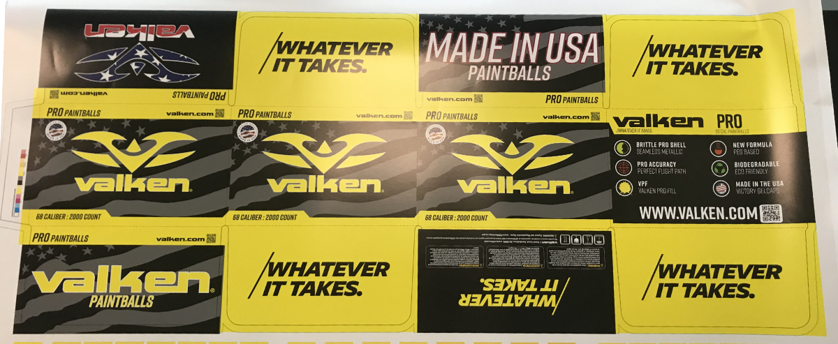
One of the first fules that I enacted after becoming Creative Director was to request proofs for every job... you can see why in the Fate picture.
To execute this, I looked to the principles of Ladislav Sutnar, a pioneer of information design. Sutnar was famous for using intense, limited palettes of flat, saturated color to guide a viewer's eyes through dense, complex industrial layouts.
This exact philosophy of playing our vivid, solid paintball line colors directly off the complex, textured black-and-gray gradients of the damasked flag background allowed our vibrant line colors to pop with maximum optical contrast.
The House Colors upheld. Now to raise the banner higher.
"Brandr"
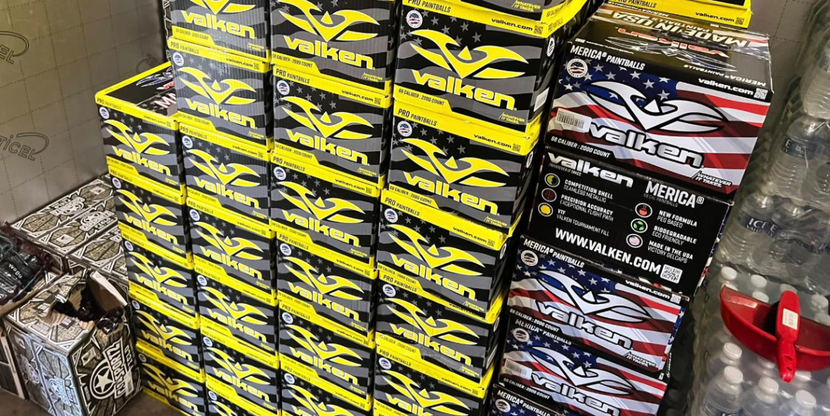 New Valken Paintball Boxes emblazoned with logo and wordmark.
Each paintall line could be determined by color at a disatnce with our logo & wordmark emblazoned upon a Merica field.
The modern word “brand” originates from the Old Norse word brandr, meaning “to burn.” Historically, it referred to a piece of burning wood, which later evolved into the practice of branding livestock with a hot iron to indelibly mark ownership.
It was a brutal, high-contrast visual stamp designed to remain clear across a crowded pasture.
In heraldry, a Standard served the exact same purpose. It was the primary flag containing the master crest of the house, flown high above the noise of battle to rally the troops.
Our legacy packaging completely lacked this definitive stamp. The corporate logo was treated as a minor, apologetic detail tucked away in a corner. The product name itself took up the lion's share of space, and our overarching brand identity was overshadowed by its own sub-brands.
By flipping this structural hierarchy on its head, I transformed our packaging into an undeniable retail standard.
The final result was an undeniable, commanding presence across all retail spaces.
When stacked on pallets or displayed on shelves, our packaging formed a unified front. While our competitors relied on overly complicated, hyper-busy, chaotic box designs that blurred into generic visual noise from ten feet away, our boxes cut through the static.
We didn't just redesign a box; we planted a flag on the retail field and burned our brand identity into the marketplace.
The Sovereign Motto and Supreme Crest borne high... Emblazoned.
E Pluribus Unum.
- Motto of the Great Seal of the United StatesEpliogue
E Pluribus Unum: latin - Out of many, one.
Our company had both a packaging problem and an identity crisis. At the time, our various paintball lines operated like a loose confederation of independent tribes. Each package design featured completely different layouts, mismatched typography, and a chaotic mix of legacy branding elements that shared almost no visual DNA.
By taking the "Merica" vector flag constraint and engineering a universal, monochromatic system, I did more than solve a retail bottleneck. I brought absolute order to our visual landscape.
Out of many fractured designs, I created one singular, authoritative brand ecosystem.
Recognizing that our B2B clients were highly engaged with our new packaging and physical print materials, I engineered our expanding in-store print marketing kits to act as a physical funnel. Every catalog, counter display, and retail aid was embedded with direct entry points and strategic calls-to-action designed to onboard our traditional brick-and-mortar dealers onto our developing B2B eCommerce platform.
Paving the road to the web with paper...