DYNAMISM: noun - 1. a theory that all phenomena (such as matter or motion) can be explained as manifestations of force. 2. a dynamic or expansionist quality.
My journey at Valken began with an initial focus to optimize the UI and Product Image Library for a new, multi-storefront eCommerce platform serving domestic and international B2B and B2C customers. The role immediately broadened past this initial scope though, with the CEO recognizing my diverse design skill set and previous management experience during orientation, as post-pandemic staff transitions had led to a significant loss of institutional knowledge that had left the company in a state of structural disorganization and the marketing department lacking leadership.
Concurrently, Valken was experiencing a severe revenue disparity, with their airsoft line significantly underperforming against their flagship paintball products. Compounding this, the sales pipeline was stalled by widespread resistance from their core B2B client base regarding the adoption of the aforementioned upcoming eCommerce platform.
The CEO invited me to address these systemic challenges, entrusting me to operate with minimal oversight, and to lead the junior designers in re-building the marketing department… especially Valken's print marketing.
It was week one. I had work to do…
"Patience in the mind and dynamism in action is the right formula."
- Sri Sri Ravi ShankarInvestigate, Inventory, & Invigorate
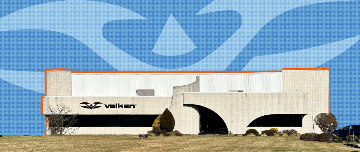
Where this adventure began...
Upon reaching the shores of this new role, I faced a dual crisis: a highly fragmented brand ecosystem and an underperforming airsoft marketing strategy. My initial assessment suggested that the marketing shortfall was deeply linked to the brand fragmentation, prompting me to investigate the root causes of both simultaneously.
To establish a benchmark for our visual identity, I immediately prioritized a comprehensive audit of existing brand assets. When I consulted the junior design team to locate these foundational materials, the feedback was unanimous and alarming, describing the company’s primary Dropbox storage repository with Dantesque foreboding... as to say, “Abandon all hope, ye who enter”.
What I found was a decade’s worth of digital sprawl that needed a complete remediation campaign… but it was a first-step, a beachhead.
Armed with a baseline understanding of our operational assets & constraints, I pivoted to the next critical priority: dissecting our primary B2B client base to ascertain the reasons for both the current airsoft marketing campaign not gaining sufficient traction and the B2B client base’s onboarding hesitancy.
Consultations with stakeholders indicated that our inconsistent marketing strategies stemmed from a cultural misalignment in the brand's approach, while the onboarding issue was a result of the majority of Valken's B2B “Dealers” being traditional, low-tech-endowment operators that were resistant to change.
These findings validated my initial assessment and converged into a single path forward: I implemented a high-octane visual overhaul of our marketing visuals that directly commanded authority within the Airsoft, Paintball and Milsim subcultures... our customer base.
By pairing this cultural alignment with targeted print flyers, we had a vehicle to bridge the digital literacy gap and show that we understood our customer base... setting us on the road towards immediate B2B dealer engagement.
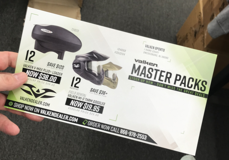
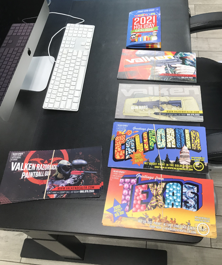
These flyers became an integral part of an expanding onboarding process.
It was week two. I had a plan...
Patient Formulation
Once the dynamic visual identity and marketing plan were established, the challenge shifted from triage to compliance: ensuring the team consistently used the correct products and assets moving forward.
While the current flyer backlog and chaotic environment demanded immediate output, I knew rushing would only perpetuate these systemic taxonomy errors. I advocated for a methodical approach to treat the underlying disease rather than the symptoms, intentionally leveraging my own unfamiliarity with the product line to build a foolproof, universal tracking system from the ground up.
To execute this under tight constraints, the solution required a tool that was agile, cost-effective, and highly accessible. I selected Google Sheets to serve as our interim product database.
This localized feature quickly caught the attention of external stakeholders. Recognizing its utility, the Sales Lead, the Purchaser, and our contracted eCommerce development team began using the sheet as a central clearinghouse. For the first time, our internal sales team, external web developers, and in-house designers were pulling from the exact same digital asset pipeline, ensuring 100% visual consistency across all channels.
As this Google "Master Sheet" gained company-wide adoption, I expanded its architecture to solve a critical commercial conflict: product names in NetSuite frequently differed from the user-friendly taxonomy of our new eCommerce site. To protect the customer experience, I used the Master Sheet to enforce a strict nomenclature standard. I mapped the user-facing website product names directly alongside their backend NetSuite SKUs, establishing a definitive, cross-departmental source of truth for both public-facing copy and fluctuating, post-pandemic pricing.
The Master Sheet was then expanded again to ensure up-to-date pricing across all marketing channels, especially print.
By taking the time to engineer a repeatable formulation for our product data, I established a foundation that cleared the backlog and insulated future workflows from systemic mistakes.
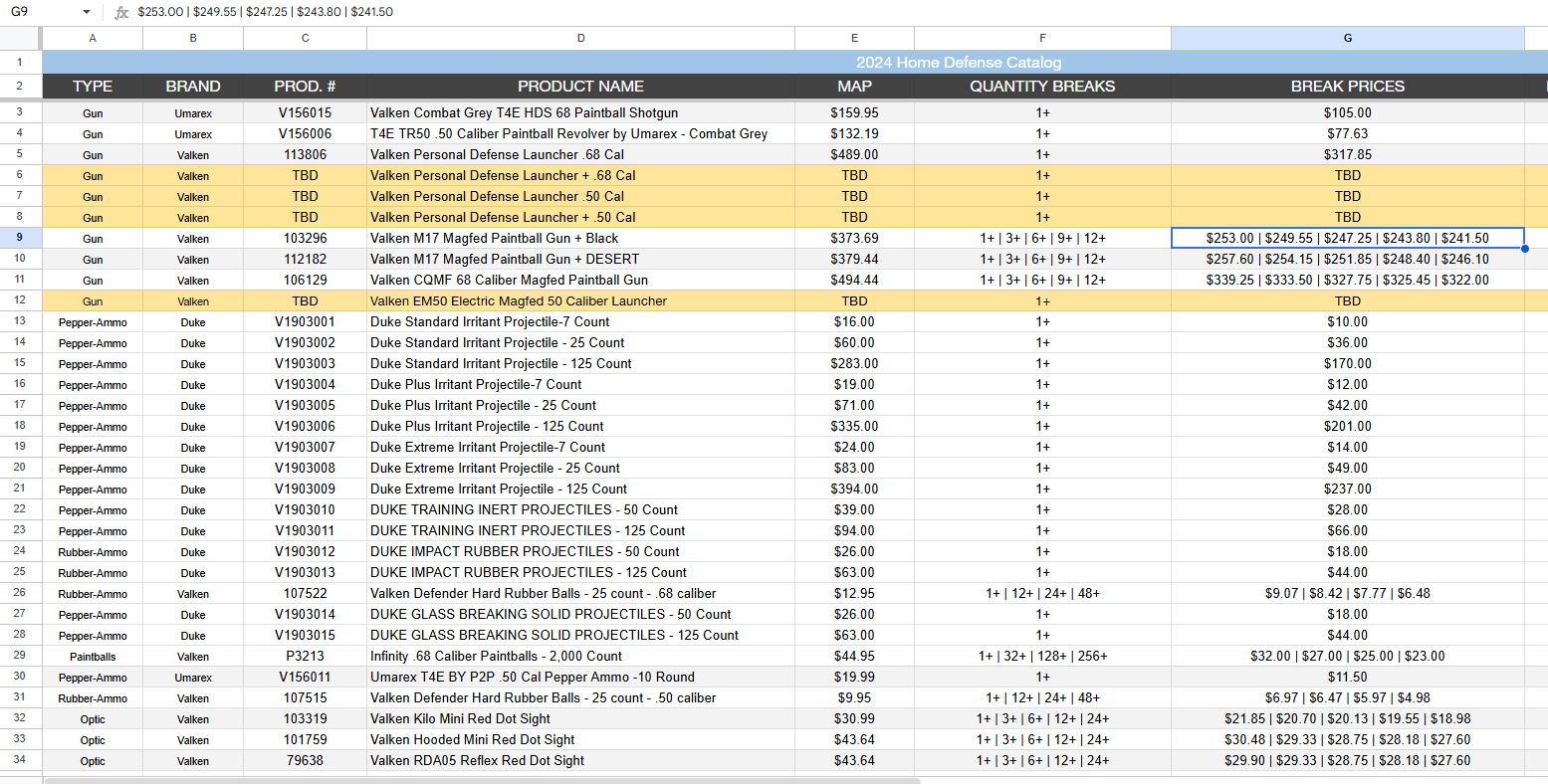
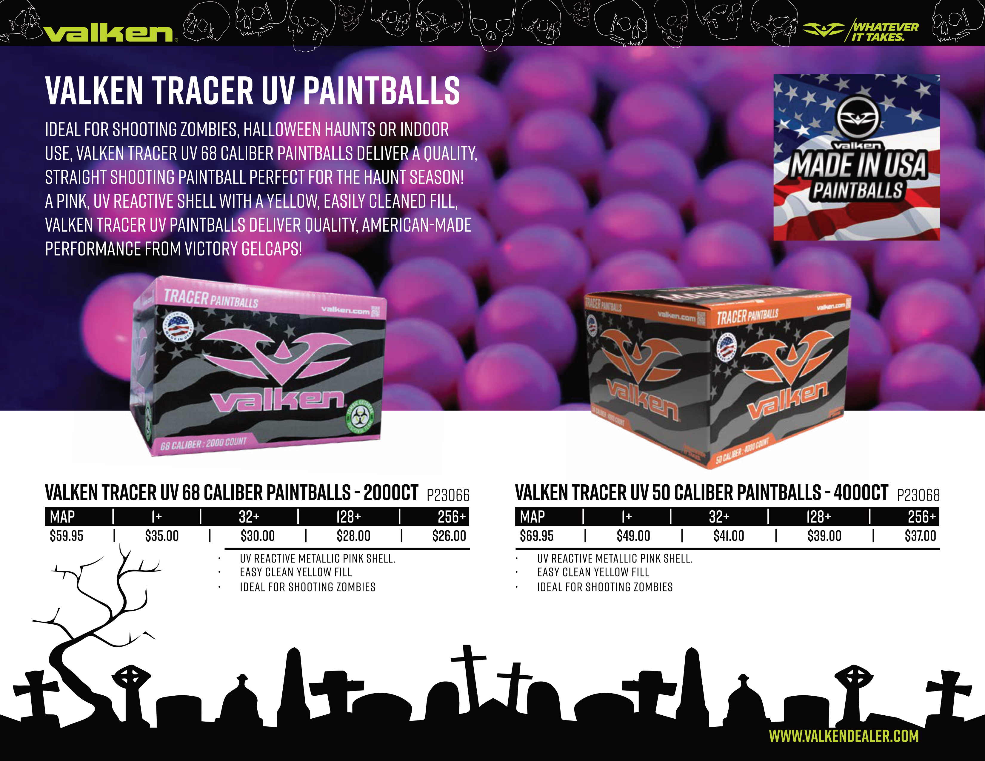
The Google-Sheet framework that grew as a way to combat digital sprawl and cross-departmental errors and one of many examples of how the data was used via InDesign data-merge.
It was week three. I had a framework…
Judging a Book by Its Cover
With the Master Sheet pipeline fully operational, I was immediately tasked with clearing a massive marketing backlog under a hefty seasonal deadline. The ultimate test was the company’s annual Christmas "Mini-Catalog"... a vital B2B revenue driver that had to be designed, printed, assembled, and mailed within a strict two-week window. This timeline was non-negotiable to ensure B2B dealers could receive and submit their inventory orders ahead of the Black Friday rush.
However, executing this campaign forced us to navigate several critical systemic and physical bottlenecks: junior designs that were nowhere near pre-flight ready, insufficient on-hand paper inventory, and a press that lacked the advanced imposition software required to automate full-bleed booklet layouts.
Recognizing that these bottlenecks could kill our tight mailing deadline I channeled my inner "A-Team Adaptability" to execute an aggressive operational pivot: Directing the team in resizing the catalog to utilize our available paper inventory during their work to properly create print-ready files, engineering a manual imposition workaround within InDesign (a process detailed in the next section) and tricking the press into executing a flawless, aligned print run.
Successfully outputting a full-bleed, saddle-stitched catalog on hardware never intended for complex production became my ultimate proof of concept. I used this momentum to address another major creative deficit: the upcoming industry trade show product catalogs. The existing design for the company’s flagship catalogs suffered from the same lack of dynamism that plagued their direct-mail flyers.
I leveraged the preventive downtime periods during Christmas Catalog batch production to proactively rebrand and redesign the company's flagship product catalog... starting with the cover.
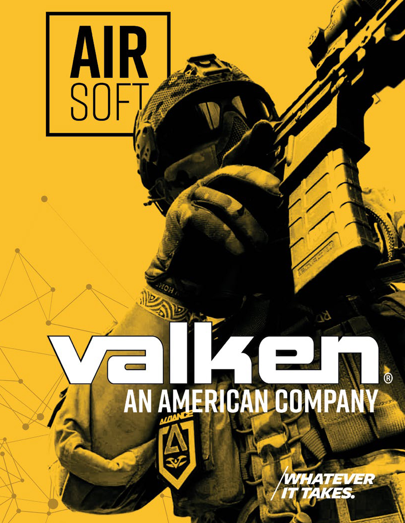
Transforming the static existing catalog cover into a raw, aggressive, high-energy style shattered the visual monotony of our competitors' traditional, generic marketing and better reflected our market authority.
Once again, infusing dynamism into the brand.
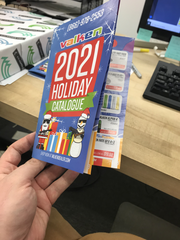
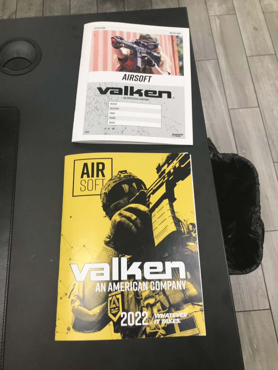
The Christmas Catalog provided me with the testing-ground for full-bleed booklet production. The image of the airsoft player provided me with the inspiration to rebrand the catalogs.
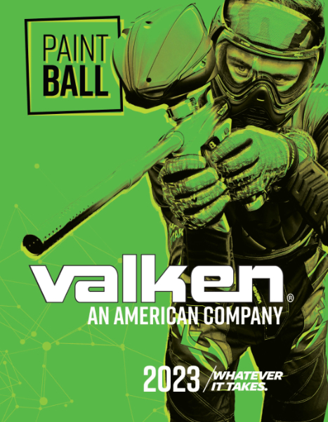
Recognizing the power of this unified aesthetic, I expanded the concept into a cohesive brand family, designing matching covers for our Paintball and Defense catalogs by applying the exact same high-contrast graphic treatment against each department's respective brand color.
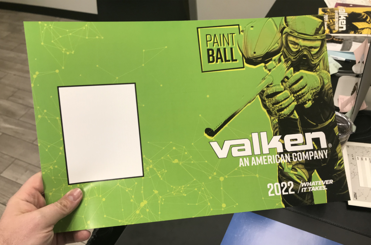
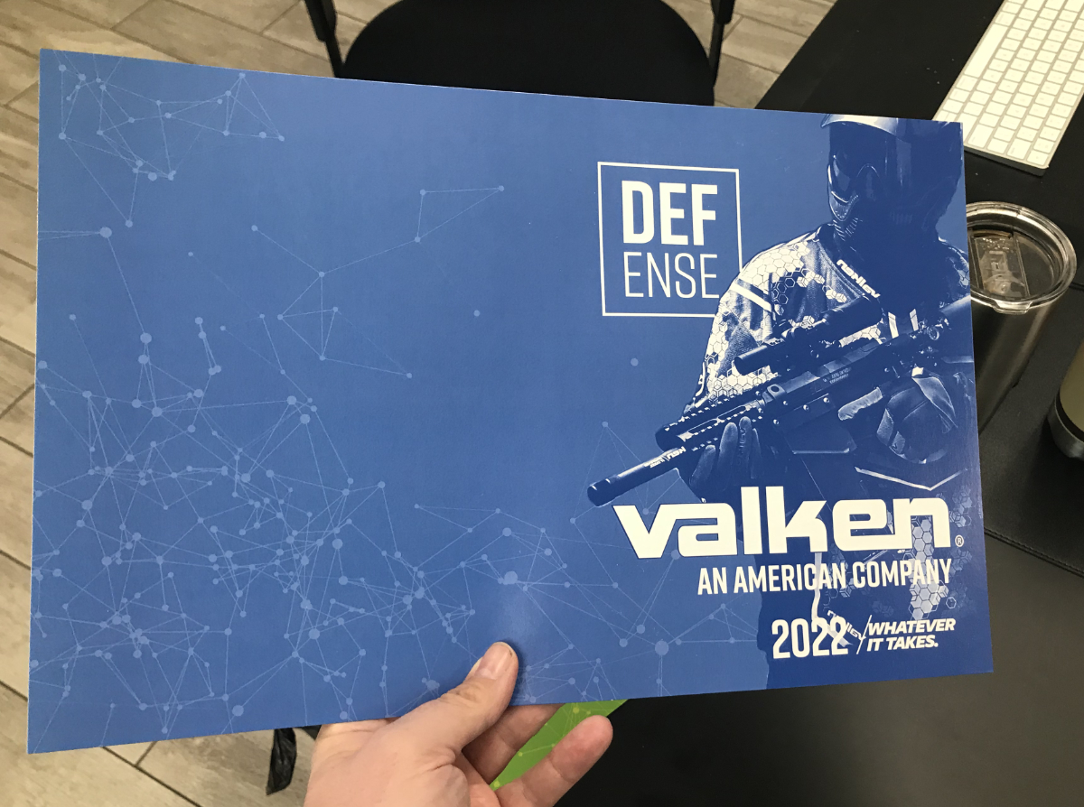
We now had a brand ecosystem that was color based and graphically exciting.
Placing the freshly printed Christmas catalog proof-of-concept and my speculative cover redesigns on the CEO's desk, I presented a high-stakes pitch… leveraging this tangible evidence of my production and design capabilities to secure full, autonomous ownership over the flagship catalog's entire redesign and manufacturing pipeline
Impressed by the initiative and proof of execution, the CEO granted me the authority to see the project through against a strict, non-negotiable two-and-a-half-month deadline.
It was week four. I had a challenge...
Turning the Page
With the flagship catalog redesign approved and a non-negotiable deadline ticking down, I faced a dual-front operational challenge. First, I had to architect the layout of the internal catalog pages while the final product selections and pricing tiers were still actively being debated by management. Second, I needed to keep our asset pipeline moving while I was physically trapped 30 minutes away at the production facility, personally printing the Christmas catalogs and seasonal marketing materials.
Following my overhaul of the catalog covers, elevating our product photography became my next critical priority. The existing images of our flagship airsoft and paintball guns were low-energy, flat, and did a severe disservice to the high-end craftsmanship of the products. To position the brand as a market leader, we needed sharp, high-octane imagery that matched the energy of the new catalog design.
I directed the team to upgrade our Airsoft Rifle photography from flat, 2D catalog shots to dynamic, angled lighting, as angled photography brings out the 3D depth, highlights the premium textures, and makes the rifles look battle-ready.
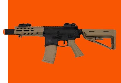
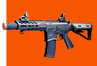
Product photography - Before & After
By transforming complex studio photography into a repeatable, foolproof recipe, I empowered our junior designers to execute flawless, consistent photo shoots entirely on their own. This allowed our creative engine to run at full speed on two fronts at once: the juniors generated a massive library of high-quality assets at headquarters, while I finalized physical production at the print facility.
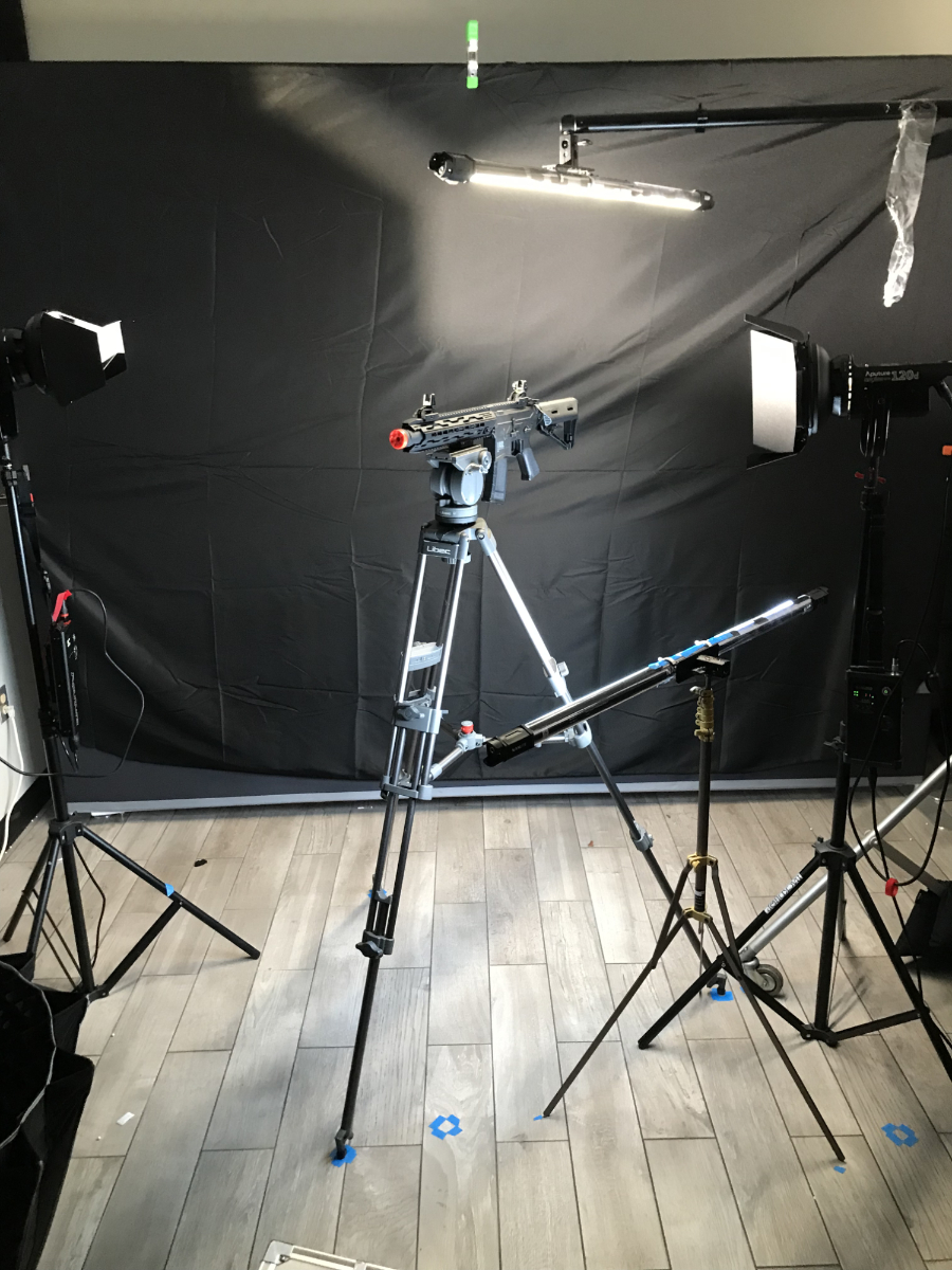
The product photo studio setup. We had to run shoots inbetween co-worker's lunch breaks.
To solve the layout bottleneck, I built highly flexible, modular templates in Adobe InDesign using parent pages and character styles that revolved around a grid structure and large, dynamic action-lifestyle photos that had been curated earlier for full-page and cross-page spreads
This structural framework allowed me to design the visual flow of the book independently of the text, and gave me the ability to swap out new product photos as they were added to Dropbox and the expanding Google Master Sheet.
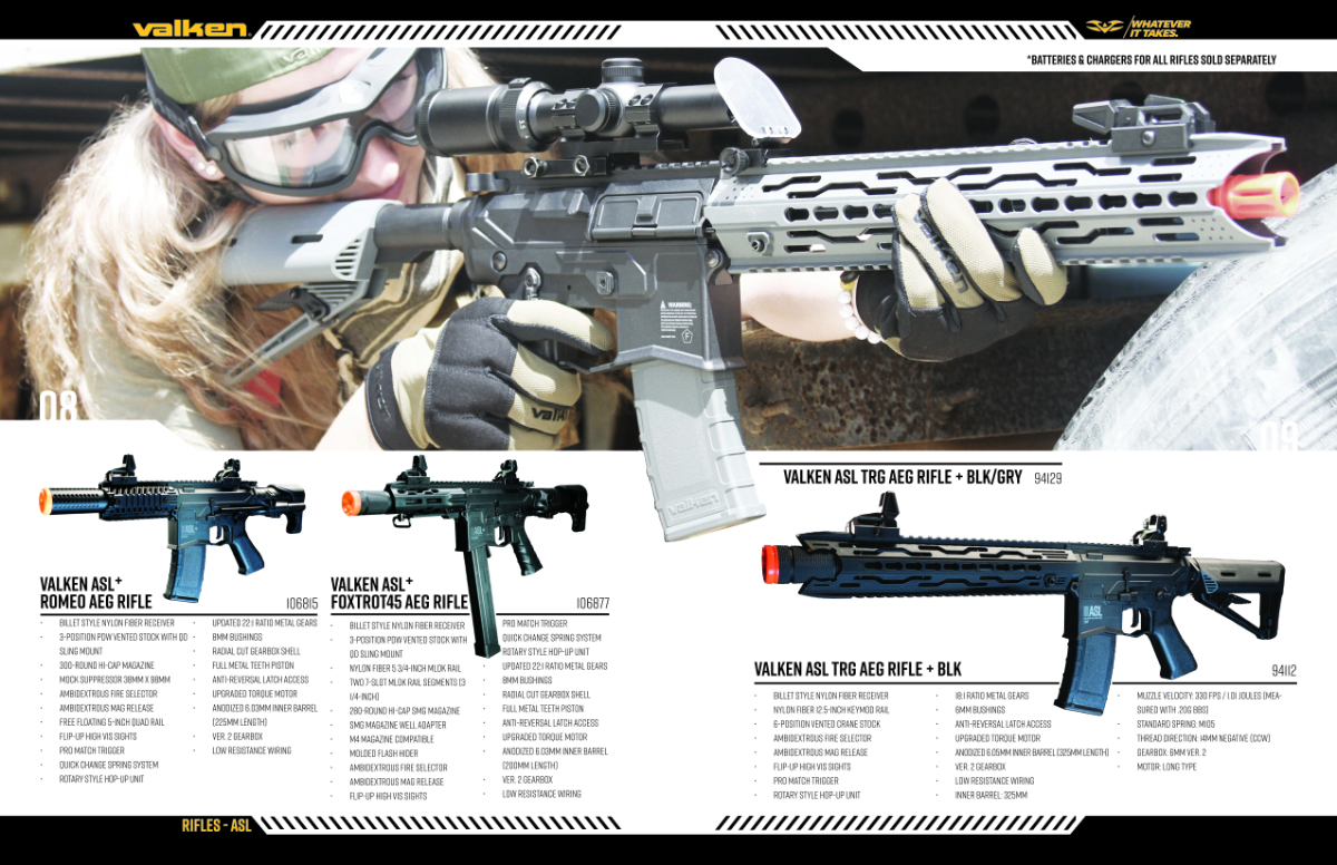
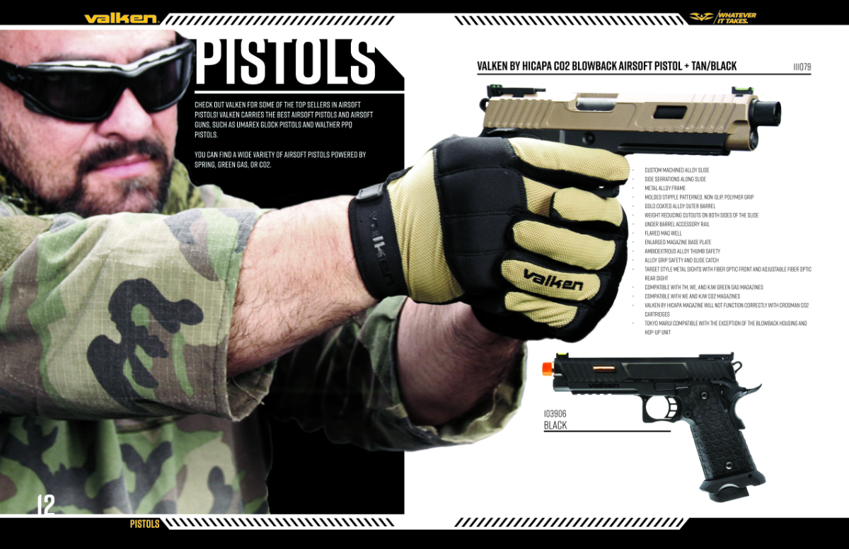 Internal spread of the Valken Airsoft catalog featuring pistols.
A combination of grid-layouts and large action images were used to imbue dynamism to the internal pages of the catalog.
With our design templates built and the new product photography pipeline running smoothly, the next hurdle was coordination. Finalizing product assortments, specifications, and pricing across four distinct catalogs required real-time synchronization with a highly fragmented leadership team.
Our Sales department operated out of New Jersey, the Purchasing team and the Vice President were based in Colorado, our primary copywriter worked from South Carolina, and the CEO was traveling through Europe for a large portion of the project. Managing this complex review process via disjointed email chains under a tight deadline would have been an operational disaster.
We once again leveraged the ever-expanding Google Master Sheet and I was made aware that Valken had an active, if not properly utilized, team collaboration & simplified project management tool that allowed us to create a workflow… Basecamp.
This workflow transformed Basecamp into a transparent, immutable project record. It kept remote executives accountable, insulated the creative team from conflicting feedback, and provided an absolute paper trail for every single catalog spread before final lock-in.
It was week eight. I had a system...
"Do what you can, with what you've got, where you are."
- Theodore RooseveltFrontier Engineering
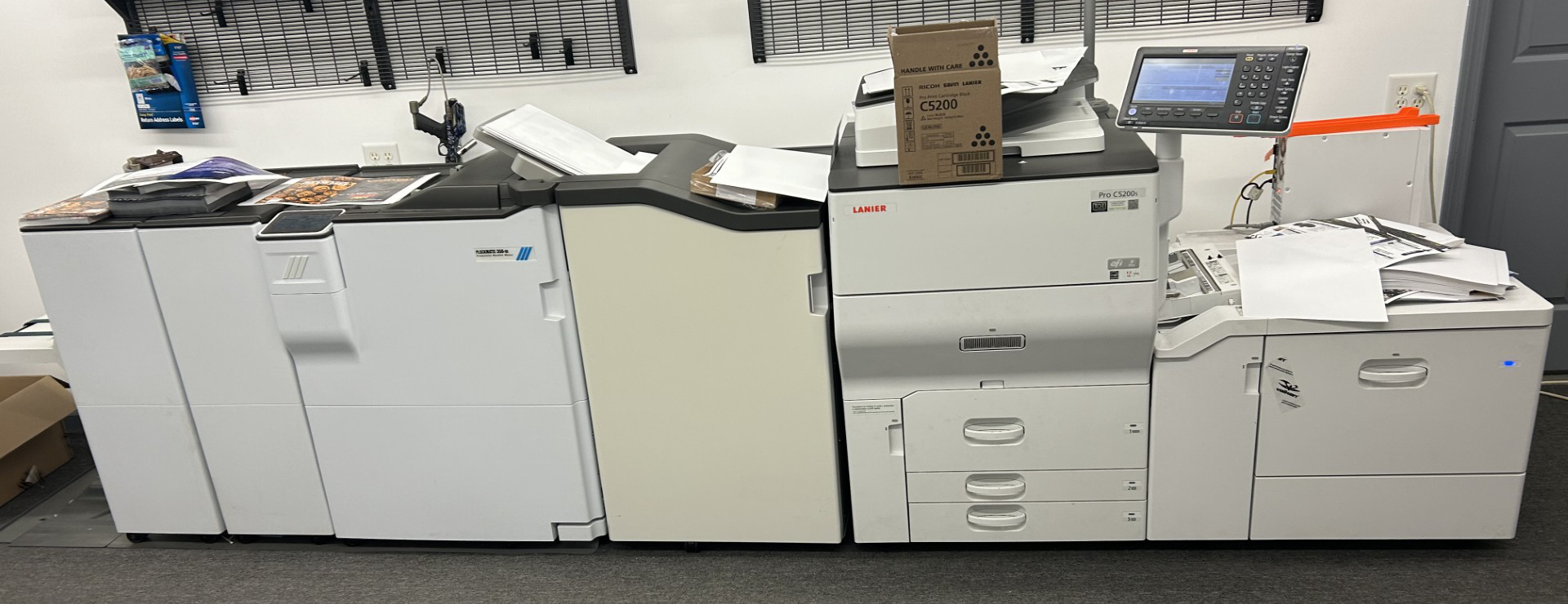
The Beast - A Lanier Pro C5200s with a Plockmatic bookmaker attachment: A piece of institutional production equipment — the class of machine that belongs in a commercial print shop, not a corporate R&D facility.
With our decentralized workflow keeping data and asset pipelines moving smoothly across multiple states, the ultimate bottleneck sat 30 minutes away at our remote print facility. Here sat an auction-bought, secondhand Lanier Pro C5200s digital press. The machine had earned a notorious reputation for constant malfunctions, paper jams, and alignment shifts. It had frustrated previous designers to the point that it was widely known across the company by its nickname: "The Beast."
Operating this facility in near-total isolation was our Head of Research & Developement. He would play a central role in many of our successful production campaigns going forward, but our initial introduction required breaking through a formidable barrier. He was a stoic professional, not easily impressed, and a man who preferred his own company, which is exactly why he ran the entire high-stakes production facility completely by himself.
Because we owned our secondhand Lanier press outright rather than leasing it, we were free from the restrictive "pay-per-print" click-charge metrics typical of commercial print contracts. I could run as many mechanical test proofs as necessary without wasting additional toner or inflating company costs. To bypass the machine’s total lack of native imposition software and its systemic tendency to jam during heavy duplex (two-sided) print runs, I engineered a highly precise, multi-stage manual workaround.
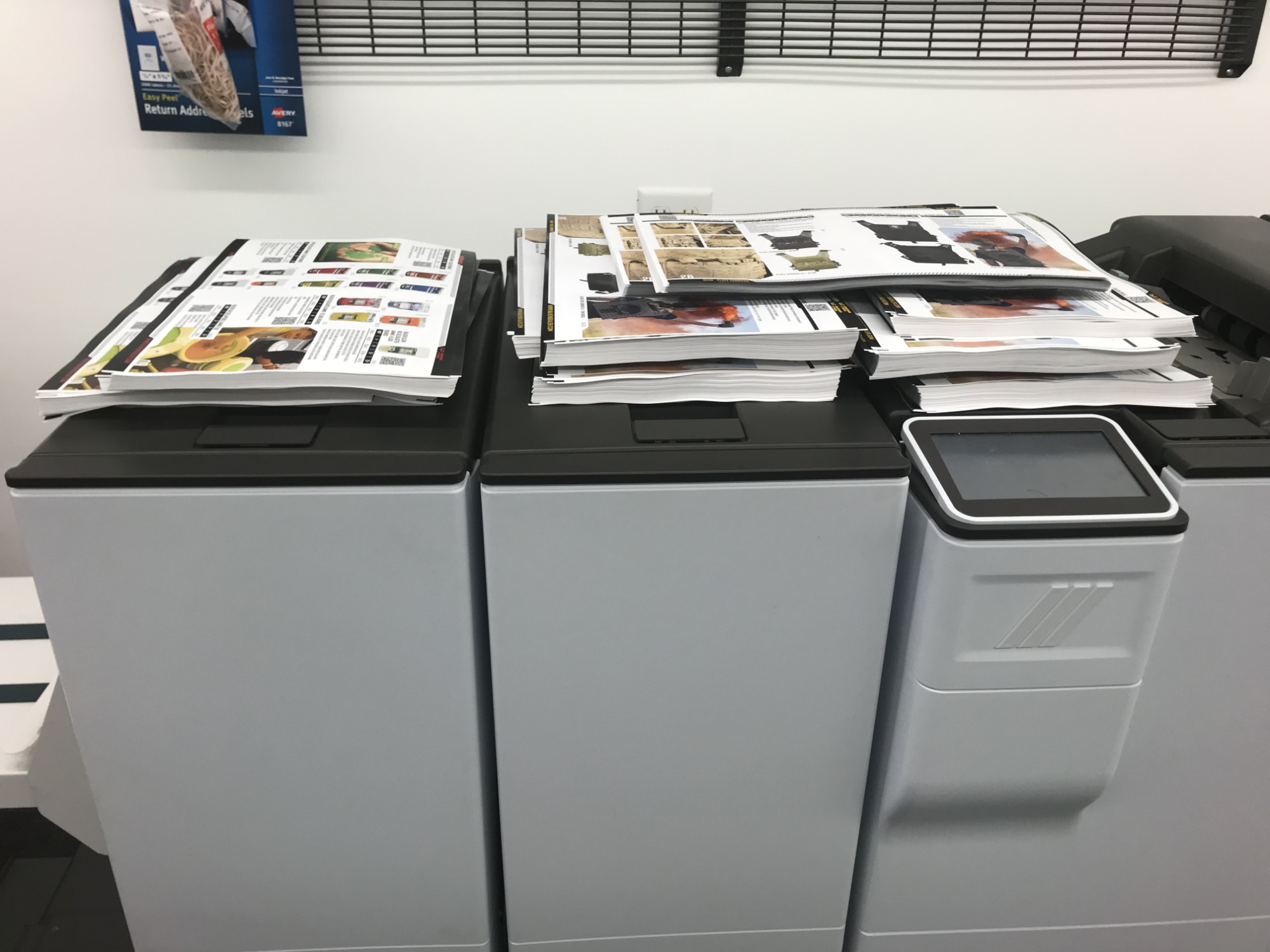 Internal catalog pages, printed and cut just waiting to be bound.
Internal catalog pages, printed and cut just waiting to be bound.
This "fake imposition" job served as a mechanical blueprint for the hardware. When executed, it forced the press to pull our pre-printed, full-bleed interior pages from the main hopper while simultaneously drawing a trimmed cardstock cover from the dedicated top inserter feed. The system fed the combined components directly into the Plockmatic booklet-maker attachment, which automatically saddle-stitched, folded, and executed the final face-trim on the leading edge.
The result was a flawless, professionally bound, full-bleed catalog manufactured on a legacy press that was never technically designed to produce it. I had everything I needed to finish the catalogs in time for SHOT Show in Vegas.
It was week ten. I had a surprise...
Thursday, January 13th 2022 - 9:30am
On January 13th, 2022, at 9:30 AM… just five days before our strict deadline for the SHOT Show in Las Vegas… the phone rang. On the line was the CEO. I was standing next to "The Beast," moments away from launching the final, massive binding procedure to ensure shipping could dispatch the finished books by Monday morning.
The CEO had a last-minute directive. He wanted to integrate a graphic of the American flag from our newest "Merica" paintball line onto the inside cover of all four catalogs. Furthermore, he tasked me to "whip up" some compelling copy that strongly implied a domestic presence without making an explicit, legally binding "Made in the USA" claim. To top it off, he requested something distinctly "typographical"... playfully throwing my own pitch vocabulary right back at me.
If necessity is the mother of invention, its grandmother is certainly sheer panic.
I had exactly zero time for complex layouts or lengthy copywriting. To solve this visual and compliance puzzle simultaneously, I engineered a stark, high-impact typographic treatment using a rigid, top-down Vignelli-style grid. I stacked the core operational pillars of the business to build an undeniable narrative framework, culminating in a bold, strategic statement:
COMPANY
SALES
SERVICE
WARRANTY
... ALL AMERICAN
This layout delivered the exact premium, authoritative aesthetic the CEO wanted while keeping our messaging entirely compliant. By 10:19 AM, I snapped a quick photo of the proof on my phone and texted it directly to him.
At 10:30 AM, the thumbs-up emoji hit my screen.
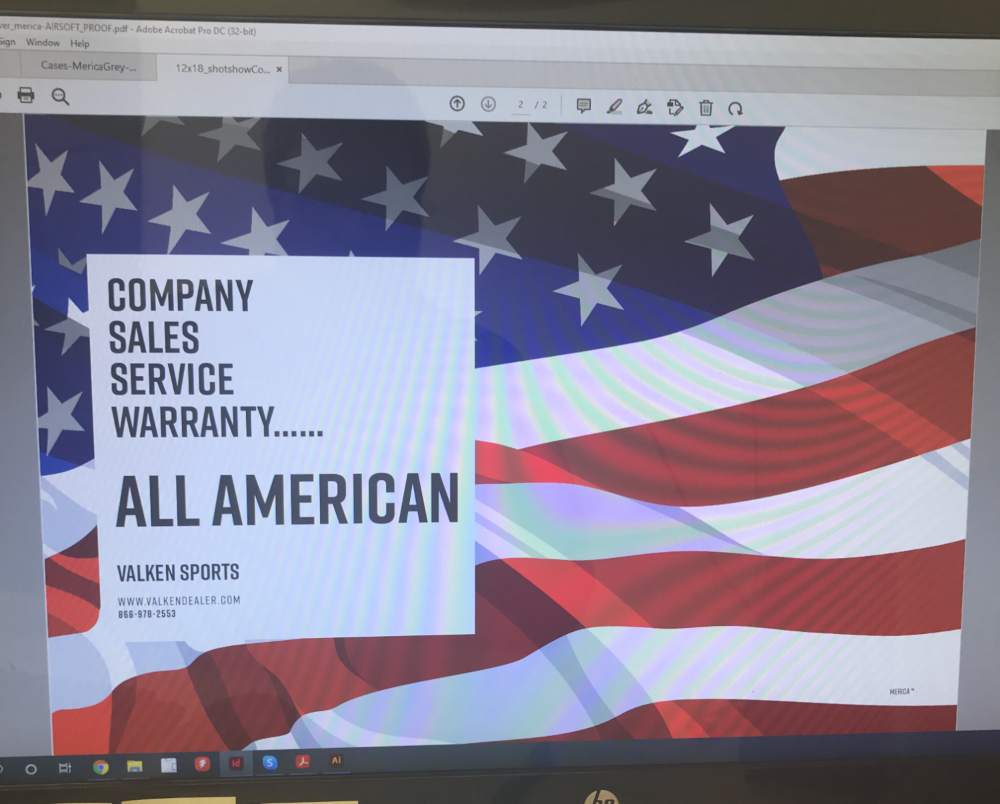
Because I had already calibrated the printer’s feed hopper to our custom, cut-down paper dimensions for the cover stock, I didn't need to reset the machinery. I simply loaded the pre-trimmed cardstock covers back into the press, ran the new inside-cover artwork, and cleared the final hurdle. The production line was officially open, and I was ready for the high-volume endgame of binding.
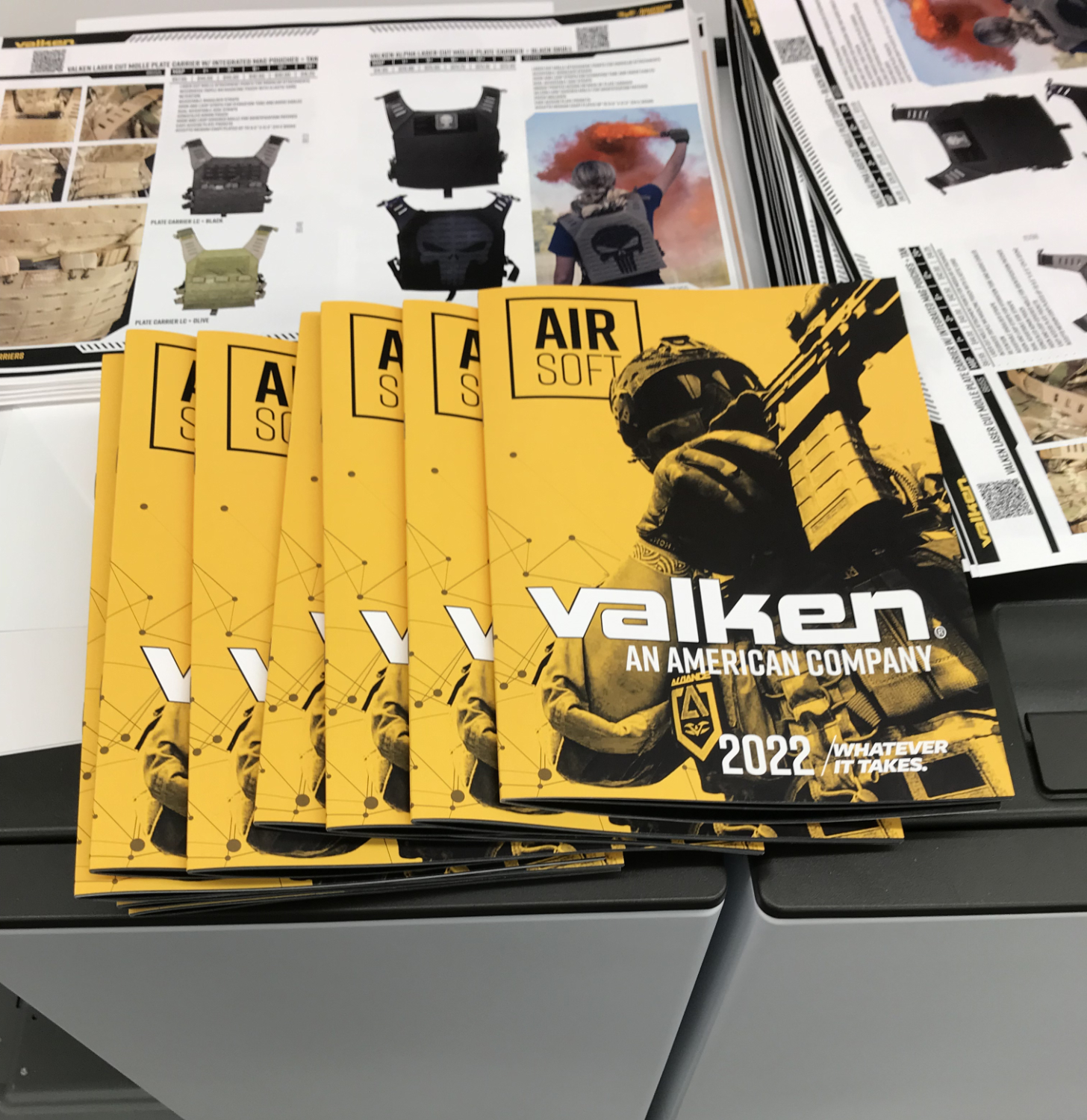
The fruit born of The Beast. This was a true sense of accomplishment.
The ultimate validation arrived on Sunday afternoon when the CEO walked into the production facility. Inspecting the final product, his corporate skepticism completely evaporated into genuine excitement. He was so impressed with the premium visual execution and high-contrast styling that he refused to wait for the standard shipping freight. Instead, he packed a dedicated batch of the fresh catalogs directly into his personal luggage, eager to show them off to industry partners before the trade show floor even officially opened.
It was week eleven. I had a victory...
Cover to Cover
The true measure of a design system is how it performs in the wild, and at the SHOT Show in Las Vegas, our new catalogs absolutely shattered expectations. Against our competitors’ traditional, formulaic marketing, our high-contrast, gritty aesthetic commanded immediate attention on the showroom floor. The catalogs not only looked premium, they drove unprecedented B2B engagement, transforming our flagship product lines into the talk of the trade show… establishing a new benchmark for our visual brand authority.
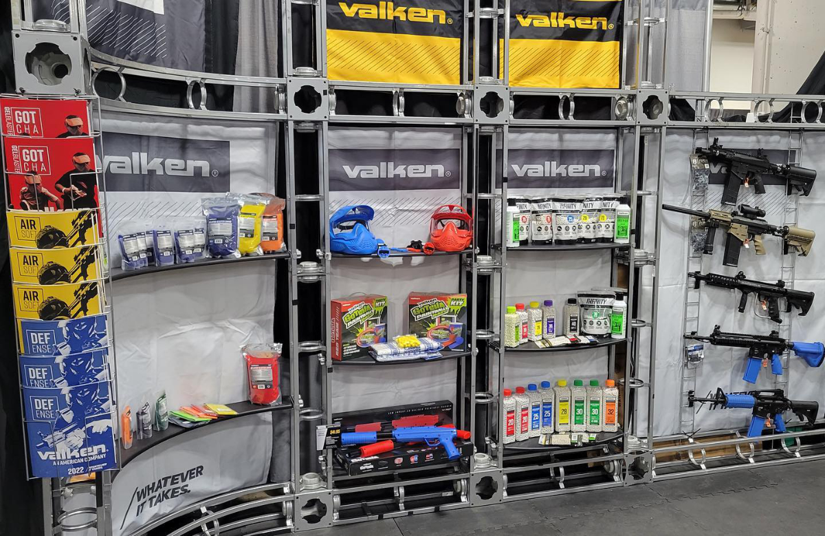
The end of a long journey.
Beyond the immediate commercial victory, this high-stakes sprint laid the groundwork for an entirely new operational era at the company. The centralized NetSuite-mapped Google Sheets, the automated InDesign data-merge templates, the breakroom photography rig, and the targeted seasonal flyers all evolved into permanent, scalable workflows. The catalogs would evolve into an in-store consumer demand generator as well as become one of the key assets in onboarding the B2B Dealers onto our eCommerce website in the months to come.
Unbeknownst to me during that grueling weekend marathon, my methodical approach to technical constraints had caught the attention of both the lead engineer and executive leadership. After the SHOT Show had concluded, I finally discovered that the CEO and the head of R&D had been using a private nickname for me behind closed doors… a title born from my penchant for engineering custom physical rigs, manual software workarounds, and solving impossible production bottlenecks with whatever resources were at hand.
It was week thirteen. I had a nickname... Inspector Gadget.
"I love it when a plan comes together."
- John "Hannibal" Smith · A-TeamEpliogue
While the industry trade show celebrated the final, polished catalogs, the real triumph belonged to the collaborative machine behind the scenes. This wasn't a victory achieved by a single designer staring at a monitor; it was a testament to a distributed, highly adaptive network of people refusing to let operational barriers dictate the quality of their output.
From the junior designers step-benchmarking custom photo templates in a repurposed breakroom, to a multi-state executive and sales team anchoring their review process to a makeshift data pipeline, every hand moved in unison under intense pressure. And at the heart of the physical production, an independent head of R&D and a newly hired graphic designer locked themselves in a remote facility, using improvised technical workarounds, manual software configurations, and raw persistence to force a malfunctioning, legacy press to perform at an elite level.
We operated in highly adverse conditions, using tools we had to invent or modify on the fly, but the synergy between creative direction, engineering grit, and executive trust proved absolute.
We did whatever it took...